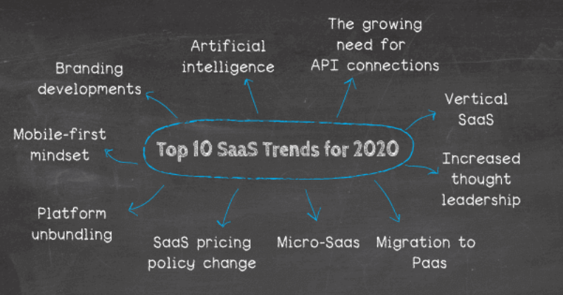
Some 2020 Trends for Making a Fresh Site on SaaS

With the future of software applications clearly being powered by cloud computing, companies that follow the Software-as-a-Service business model face strong competition. SaaS can be a good source of revenue potential as long as prospects can be continuously enticed to discover and learn about products. In recent years, landing pages have become crucial in terms of marketing SaaS products, and a certain design sensibility has emerged in this regard.
The goal of all landing pages is to generate conversions. Think about a visitor who arrived via an email marketing campaign; he or she will expect to see a continuation of what was explained on the message, and the design should be conducive to taking the next step, which could be trying out the SaaS product or signing up for a subscription on the spot.
As of 2020, some of the design standards that have emerged in relation to SaaS landing pages include:
-
Logos go on the top left section, and they should feature no more than three colors.
-
A login section should be placed on the top right in case the visitor is already a subscriber who wishes to use the landing page. All the same, this may be a repeat visitor who is ready to subscribe, so there should be a "sign up" element next to the login.
-
Navigation elements and icons should be sparse, but they should not be skipped because doing so would amount to poor user interface design.
-
The jumbo animation or hero graphic should be explanatory and motivational; as much as we all hate buzzwords, this is the rare situation in which they actually serve a good purpose.
-
One-page landing sites are perfect for SaaS, but visitors should not have to scroll down too much to find a call-to-action. Subscription pricing graphics or text should be accompanied with the option to sign up on the spot. Free demos offered without pricing information tend to make visitors feel as if the product will be expensive; on the other hands, demo offers next to price tags are considered to be refreshing.
One of the most common frameworks for SaaS landing page design is React.JS, but this is mostly because of the templates. WordPress landing pages are also very popular. For more information click here https://v.redd.it/t2nv5ufg9hk41.
