Color Trends of 2017 (Using Natural Greens in Digital Design)

The Color of the Year
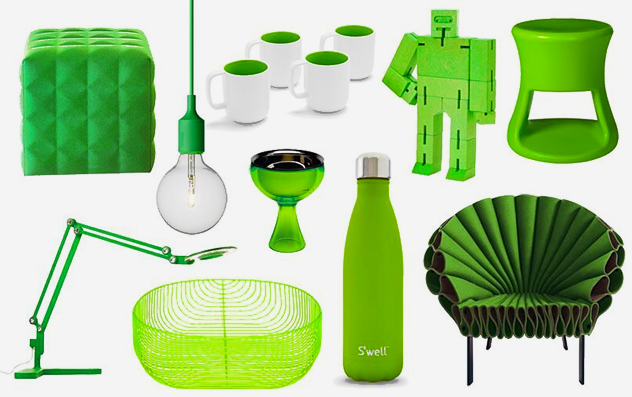
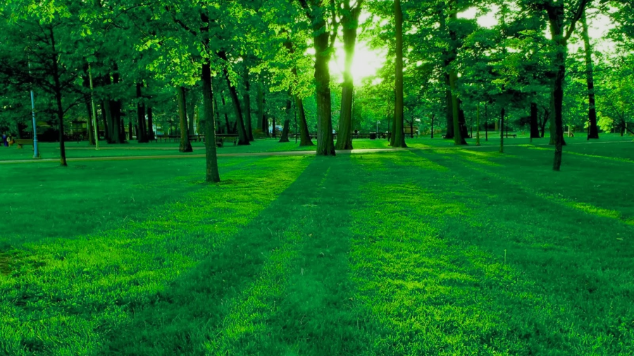
As a graphic, web or product designer, it’s as important to keep up with current color trends as it is for a clothing or interior designer. The ultimate arbiter of the newest color trends is, of course, Pantone, and for 2017 they have named Greenery 15-0343 as the Color of the Year, describing it as a “fresh and zesty yellow-green shade that evokes the first days of spring.”Green is a ubiquitous color in our environment, and the natural hue of this year’s color is particularly soothing in what may be prove to be troubled times. Similar shades can be seen used in a variety of products.

Other Colors for 2017
The color of the year is not, of course, used in isolation from other colors, so appropriate hues from around the color wheel are also going to be very popular in 2017.
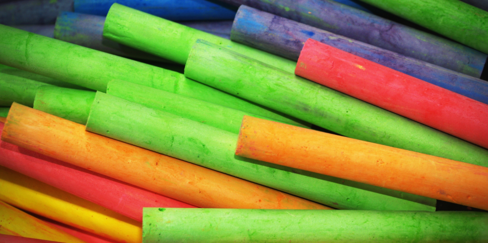
Looking at nature, we can see that purplish-browns and grays coordinate well with the fresh grass-green of the color of the year, but Pantone has also included brighter shades in its top ten colors for 2017. It’s up to you as a designer to mix and match these colors effectively.
Incorporating Color Trends in Design
Obviously the colors of the year are not the only ones out there to use, but we are a fashion-driven culture, and we instinctively seem to be drawn to designs and products that use the current color choices. You can’t change a logo or iconic packaging to satisfy the whims of fashion, because brand identity would suffer, but at the same time, it is possible to use the trendy colors to attract and keep the customer’s eye on your work.Greenery 15-0343, for instance, is a shade that, although strong, could be used as a background for a photo collage on a website. Green, just as grass and leaves do in nature, can be used with almost any other color without clashing, but rather complementing all shades from brilliant to muted. Green acts as a versatile bridging element between colors that might not otherwise work together, without being as stark as white or black.
Pink Yarrow, Flame and Lapis Blue are all bright, intense shades which would stand out in a graphic design, either singly or in some combination. While they would be overwhelming in a large, solid block, they could be used very effectively as accent colors or for typography.
