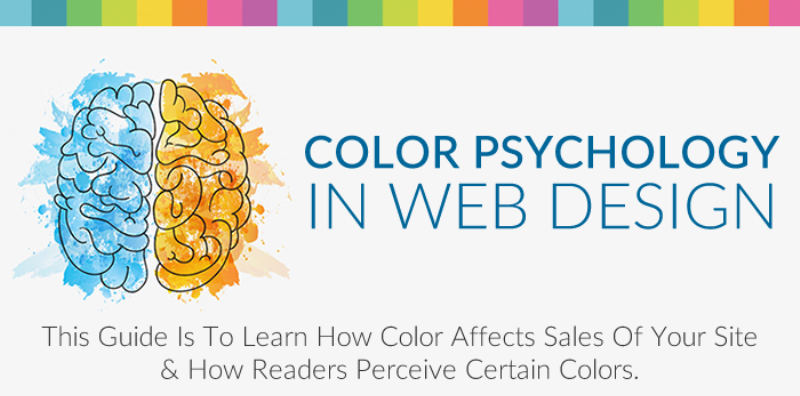
How Web Designers Use the Psychology of Color to Evoke Visitor Emotions

Web designers consider psychological factors when creating a website. Unlike computer science, which is math, algorithm analysis and other related topics, web design requires creativity and an understating of psychology.
Color
When viewing a new website, the first thing most people notice is color. Colors invoke emotions, which any good web designer keeps in mind when choosing a color scheme. Use these colors wisely: Black - sophisticated, formal White - pure Light blue - calming Green - healthy Red - passion, love Yellow and Orange - excitement or thrift
A website's primary and secondary colors should remain true to your brand's personality, while the accent color, which should be about 10 percent of the website, should complement the site's overall design.
White Space
Strictly speaking, white space can be any background color. People like simple, predictable websites that don't overwhelm them, which is why white space is so important. One object, surrounded by white space, makes a statement. It can be an image or text that tells visitors what the site is about. Google's home page is the ideal example; it is about searching the web. The search bar is surrounded by white space, indicating that the visitor should type in a query.
Simplicity
Websites shouldn't throw everything at visitors at one. Stating the most important value proposition is enough; anything more will overwhelm visitors. Don't put the latest blog post, widgets or anything that distracts the visitor from converting.
Images
The human brain processes images extremely quickly. Powerful images focus on one object. They are clear, crisp and large since the home page only needs one image. Too many images are confusing.
Web designers don't place anything on a website without thinking about it's purpose and how it will be received. For more information click here https://v.redd.it/gy8f41cfgs211.