Minimalism: Saying More with Less

What is minimalism?
Minimalism is not just a trendy graphic design style. It’s a long-established school of art and architecture whose goal is to strip away everything that is unnecessary, leaving only the essentials behind. Think of clean, sleek furniture designs, or modern skyscrapers with straight, unadorned lines.
Minimalism has long been a popular graphic style as well, with many great examples from the mid-20th Century on, and it is currently again a popular choice. It’s a reaction against visually cluttered layouts, where so much is going on that the important information gets lost. While it won’t work in every context, it’s worth exploring as an option to make a big visual impact while at the same time conveying the essential message.
Great examples of minimalism

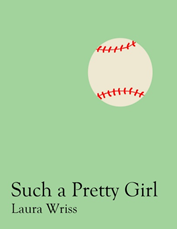
When minimalism works well, it’s an extremely effective way to catch the attention of a viewer and at the same time giving them enough information to make a decision. This book cover is a good example. Even without knowing anything about the content of this novel, the juxtaposition of the title “Such a Pretty Girl”, and the flat drawing of a baseball sums up what is no doubt the underlying conflict of the work. It’s a good bet that the pretty girl of the title is a tomboy, and so has to deal with the expectations of her society that she behave like a girl.

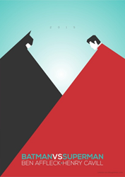
Here’s another good graphic representation of a conflict, this time in a film. The visual representations of Batman and Superman are boiled down to easily-identified stylized drawings of their faces, with large solid blocks of color, identical in size and shape, to represent their two capes. We know that they are in conflict because they are placed in opposition to each other, with a V created out of the negative space, and we know that they are evenly matched because they are exactly the same size. Although we see more of Superman’s cape than Batman’s, the heavier visual weight of the black makes it seem equal to the red. It achieves an excellent balance between the two, which is the essential conflict of the film. And it’s all done with two large triangles and two small squares.
Planning a minimalist design
How can you use minimalism effectively to grab attention and convey essential information?Use simple, crisp, fonts. This is not the place for unnecessary ornamentation. However, since the typeface is an important part of the design because there will be so little else on the page, find something that will enhance the design and work with the theme. Sans serif is not necessarily desirable. Play around until you find what works for the design.
Minimalism does not require artwork. Some very effective graphic design can be achieved with just the judicious use of text. This text-based design uses a simple font and color to fill the space.
Well-executed artwork can make a huge impact in a minimalist design. Keep it simple. Make it dominant on the page, whether big or small. Use solid blocks of color rather than subtle shading and shadow effects. If you use a photograph, again use it sparingly, and go for something with an uncomplicated shape and color, such as this book layout. The whole idea of minimalism is to avoid visual noise created by too much variation.