The Growing Trend In Fonts
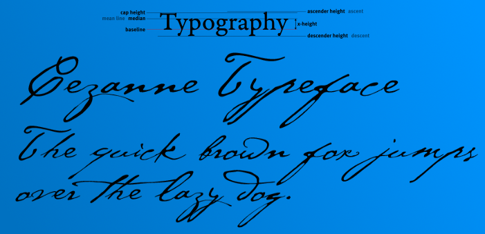
When it comes to the Internet, there is a trend for designers to design with lighter and more thinner fonts. The reason this trend has been catching on is because designers want to make a more appealing font for younger viewers. These designers believe their clients may be tired of seeing the same fonts, and they want to give them designs that are innovative. Unfortunately, this is a trend that is making reading fonts even harder for those individuals who are seeing impaired.
Why We All Need The Internet
The Internet has quickly become a an indispensable resource. The Internet is needed to check email, to sign up for programs, to find assistance, and to get any basic information. Since that is the case, regardless of age, everyone needs to be able to maneuver the Internet with ease. Since the Internet is something that can be foreign to individuals who are advanced in age, they have to be taken into consideration when changes occur to the internet. There is a huge community of individuals who are age 60 and above. These individuals are savvy when it comes to the Internet, but they still may have problems with failing vision.
Kevin Marks Plea To Software Engineers
Kevin Marks is a famous blogger, and he is also the founder of Microformats. Marks has been studying these trends; he is disturbed by this movement to reduce the size of fonts and also to reduce the contrast between words and their backgrounds. Since older individuals may already have a tendency to have problems with their vision, these changes would make it even more difficult for them to be able to read on their devices or computers. Kevin Marks is urging software designers to take into account individuals who have failing eyesight. These new fonts put these individuals at a severe disparity. Even though web design has evolved and will continue to evolve, topography can still follow some basic rules in order to consider those individuals who are at a disadvantage.

