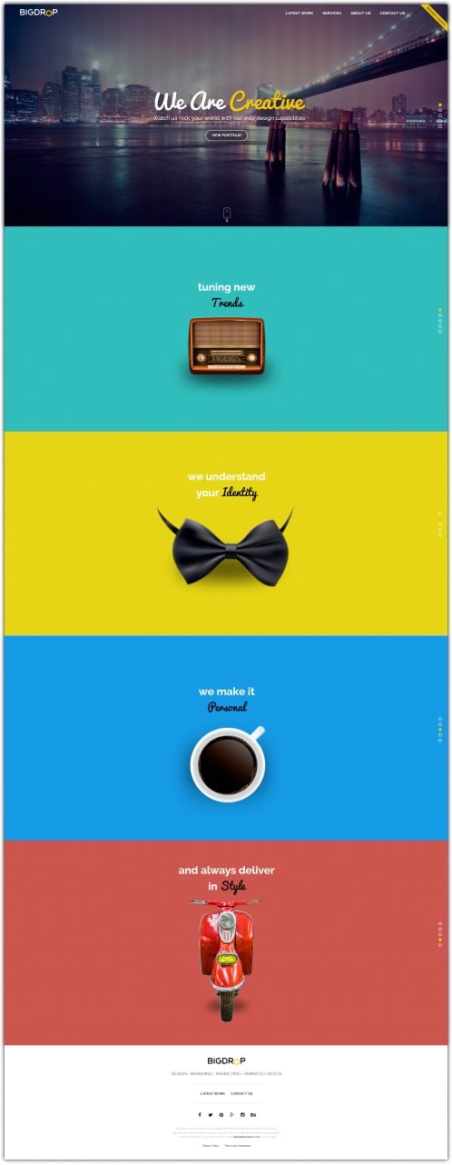
Single-Page Website Design

Why use a single-page website design?
In our daily life, we have all found ourselves getting lost in the tangle of a website with multiple pages, never quite sure of where to go to find what we want. This has led some designers towards a simplified website consisting of one page.
That’s it. Not a landing page that leads you on to various sub-pages or sections. Once you arrive at the site, you have no further navigation.
Obviously, this one-page solution will not work for all websites. However, there are many instances in which this elegant, intuitive format will be just what both the site owner and users need.
Advantages for the site owner and designer
You have a service or product to sell, or heck, even just something you want to put out there to share with the world, like this intriguing infographic. You could be a huge company that wants an individual product to stand on its own.
Or, you could be a small entrepreneur with one or a few products or services for which you don’t need a complicated, multi-level site structure to communicate all the necessary information to potential clients or purchasers.
Either way, a one-page website will save you time and money in web design and maintenance. The limitations of the format will force you to consider what is really important, resulting in a cleaner, more immediate message to the user.
One-page website layout
Advantages for the site user
A well-designed one-page site can be a much better experience for the user. In today’s world, many of us do much of our web browsing on a mobile device, and a simple one-page site is easier to scroll through instead of having to click on tiny tabs or buttons. A smaller site also uses less bandwidth, which can be a boon for users with limited data plans.
When a user is not confused about where to go, when there is a linear progression down a single page, it can create a more positive feeling in the user for your product or service. Simple is better than complicated.
A one-page website is not necessarily one that can be seen in its entirety all at once. Rather, the idea is that the entire site loads all at once on one page that the user can then scroll on down through. This eliminates the tedious waiting for a new page to load, creating a single, fluid experience.
One of the great things about a one-page layout is that the designer controls the viewing experience, much more than when the user can jump from one page to another. It lends itself well to a narrative approach. While it is possible on a longer page to provide navigation buttons for the user to jump to a specific spot, they aren’t necessary.
One-page websites lend themselves to strong visuals. This is a great place to use a stunning photograph or graphic as a background to your text, or lead the user down the page with an inviting infographic.
Will a one-page website work for you?
Ask yourself:
- Can you present the essential information about your product or service to potential clients or purchasers in this format?
- Can your product or service be well-served by the strong use of visuals?
- Does your story lend itself to the linear narrative of scrolling through a single page?
You may be pleasantly surprised by the results! One company found that using a one-page format resulted in a 37.5% increase in sales. Trying the one-page website format could lead to a similar outcome for you. What have you got to lose?

