Using Animation in Web Design

How it Works
At its simplest, animation on a webpage means having elements that move. Back in the 90’s, users soon tired of sites that were cluttered with gifs that did little but add visual noise to the page.
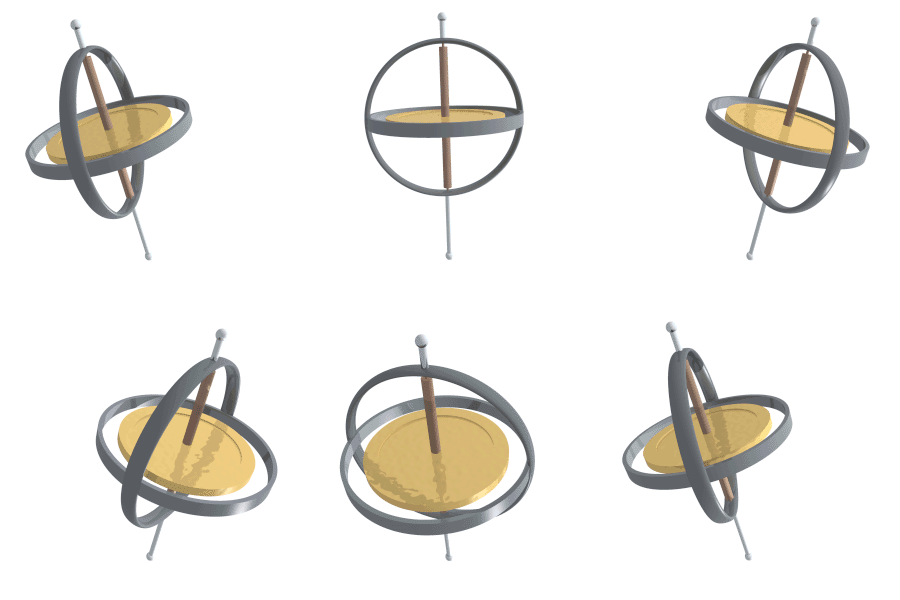
Like this spinning gyroscope, which does nothing to help guide a user through the webpage, but just takes up space, and let’s face it, can cause some users to get dizzy and decide to move on to a less busy site!
Today, there are much more subtle and sophisticated ways to add different types of motion to a webpage, and add to the functionality of the page. A good web designer will carefully select the most appropriate forms of animation that will keep the user on the site, and help that user to successfully complete their transactions while there.
FLASH used to be the industry standard for bringing motion to the web. However, it has been superseded by JavaScript, and now by CSS, which can be used to design much more effective animation without slowing down the user experience. There are many tutorials out there to help you learn how to use these tools effectively, such as this one for CSS.
When it Works
Attracting Attention
At its most basic level, animation can be used to draw the user’s attention. First, when a user is browsing the internet without having a specific site in mind, a website which has eye-catching animation on its landing page may keep the user there long enough to engage their interest in the content or products or services being offered.
Loading and Transitions
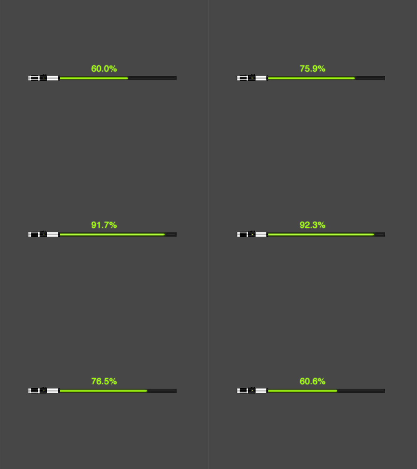
No one likes waiting for a website to load, or down time while waiting for a transition to another. However, if there is something to hold the user’s attention while the process is completed, or to assure them that progress is being made and that the site hasn’t frozen, the user is less likely to give up and move on to a different website. The animation could be as simple as a progress bar, as long as it keeps moving towards completion.Guiding Users
Once the user has moved on to exploring the webpage, animation can be used to draw their attention to the most important elements, such as navigation bars or purchase buttons. A menu bar could slide onto the page, or a “Buy Now” button might flash to catch the user’s eye.Storytelling
When a website has a story to tell, such as the development of a product, using animation either on a static page, or as the user scrolls down, can add a level of detail and user engagement that keeps them on the page. They want to know what happens next.When to Avoid Animation
Speed
It doesn’t matter how cool your animation is: if it slows down the loading time of a webpage to the point that a user is going to give up and move on to a more responsive site, your design has failed. If, once a page has loaded and the user is navigating around the site, the response after clicking on an animated element such as a purchase button is too slow, it’s not working. Use the most efficient tools out there to create and implement your animated design elements. Currently, that probably means CSS.Distraction
If your web design doesn’t help the user effectively navigate the site, and instead just adds non-productive busy-ness to the page, you haven’t done your job as a designer. Make it both beautiful and useful.You also need to consider how often users may visit your page, and what the long-term effect of an intensive use of animation may have on return visitors. An animated landing page that is charming or amusing the first two or five times may become downright irritating by the twentieth iteration. Keep the sequences as short as possible to avoid animation fatigue on the part of your users!
It’s also a good idea to provide opt-out buttons for at least some of your animated design. The “Skip intro” button is, of course, a classic by now.
Like all design trends, animation can be overdone to the point that designers and users alike tire of it. However, it has so many potential uses in improving the appeal and functionality of a website that instead of going away, we can expect to see further improvements in the tools available to make animation a seamless and integral part of web design for the foreseeable future.